
Bullion in Motion: Design Inspired by Solid Gold Forms By 444 Jewelry & Co
- Feb 28
- 3 min read
Updated: Apr 4


About this idea of gold lately.
Why I Keep Designing Gold Like Bricks
Not diamond-heavy, not iced out, not hollow. Just… gold.
Like actual bullion.
I think that word changed everything for me.
Bullion feels serious.
Bullion feels accountable.
Bullion feels like something that sits in a vault except now it’s on your body.
You know how when you see old photos of African kings especially West African royalty. They’re not wearing “cute” jewelry? It’s not delicate. It’s not trying to sparkle for attention. It’s heavy. It’s solid. It almost looks excessive, but not in a flashy way. In a this-is-power way.
That’s been sitting in my head.
In traditional West African gold jewelry, Gold wasn’t ornament. It was wealth you could see. It was storage. It was authority. It was almost like walking around wearing your treasury, like visible economy.


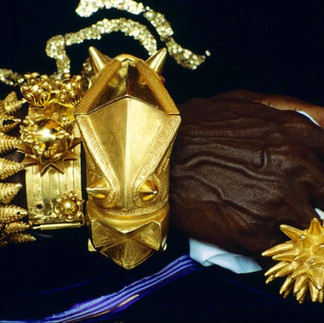


Archival imagery sourced from twitter via @AkanArchives
When I designed this piece, I didn’t want it hollow. That part was important to me. I didn’t want it to look big and feel light. That feels dishonest.
In my approach to solid gold jewelry design, I wanted it to actually be a block of gold. A carved brick. Think decorative-shaped gold bricks.

The first layer is literally that a solid mass that’s carved to hold the stones. Not plated. Not inflated. Not engineered to look heavier than it is. Just gold doing what gold does.
Then I added the second layer. And this is the part I love.
The outside isn’t polished like glass. It’s sanded. It has this almost molten, imperfect texture. Like gold that hasn’t fully decided what it wants to be yet. It feels more grounded. Less showroom. More earth.
Because I don’t see gold as this overly refined thing. I see it as something pulled from the ground. Something raw before it becomes luxury.
And inside that structure, I placed natural stones.
This one has citrine oval, warm, almost like bottled sunlight. I’ve always loved citrine. It feels optimistic without trying too hard. And then the chain fades from citrine tones into emerald. And that wasn’t even some grand symbolic decision. I just genuinely love those stones.
I think subconsciously, I’m trying to modernize something ancestral without copying it.
I’m not interested in gold as decoration anymore.
I’m interested in gold as substance.
I don’t want to recreate traditional regalia. I want interpretation. More like Translation.
What does African authority look like through my hands?
Maybe it looks like bricks.
Maybe it looks like mass.
Maybe it looks like gold that refuses to be hollow.
This is just my modern interpretation of that feeling. What does “brick of gold” look like in
2026? What does bullion-inspired gold jewelry look like when it’s designed by someone working between Lagos, Nigeria and the global luxury space seeing those images and thinking, that’s powerful?
That’s what this is.
It’s architectural. It’s heavy in intention. It’s layered literally and emotionally.
The polished inner bezel is controlled. Clean. Intentional.
The outer sanded finish is imperfect. Textured. Almost primal.
That contrast… I love that contrast.
And honestly, I think that’s why I couldn’t settle with the word “ornament.” Ornament feels light. Decorative. Optional.
Bullion feels stored. Measured. Accounted for.
This isn’t something you throw on.
It’s something you carry.
And maybe that’s dramatic, but that’s genuinely how it felt while I was building it in Rhino at like 2 a.m. zooming in on curves and thinking, no, this needs to feel like mass.
Not sparkle.
Mass.
That’s the thought process.
It’s not about excess. It’s about weight. Cultural weight. Material weight.
And I think that’s where I’m headed with gold now.
This approach to solid gold jewelry design isn’t about decoration. it’s about presence.
Explore more custom gold jewelry or read design journal on 444 Jewelry & Co.


Write a book someday..
Wow. This really speaks to the process and detail. It’s inspiring and gives a fresh perspective of what it means to create like you do.